Author Archives: kelsey, etc.
Seven creative projects and small adventures I want to take on in 2025

In addition to continuing with my regular memorykeeping practice, I’m hoping to make more things and go on more small adventures this year. Here are seven creative projects and small adventures I’d like to take on in 2025:

1. Build a website from scratch

For what? I don’t know yet. Maybe one of the many iPhone photography projects I’ve got going on. Maybe for something I haven’t thought of yet. Back in the day when personal blogs were a thing, many of us learned basic HTML and CSS so we could customize our blog’s look and feel to our liking (who else remembers Katrina’s incredible labor of love Pugly Pixel? Or Elise‘s very beginner-friendly HTML e-courses and workshops?). It’s been about a decade since I’ve put any of what I once knew to use. I’d like to try. And I’d like to learn more than I did before.

2. Disposable camera

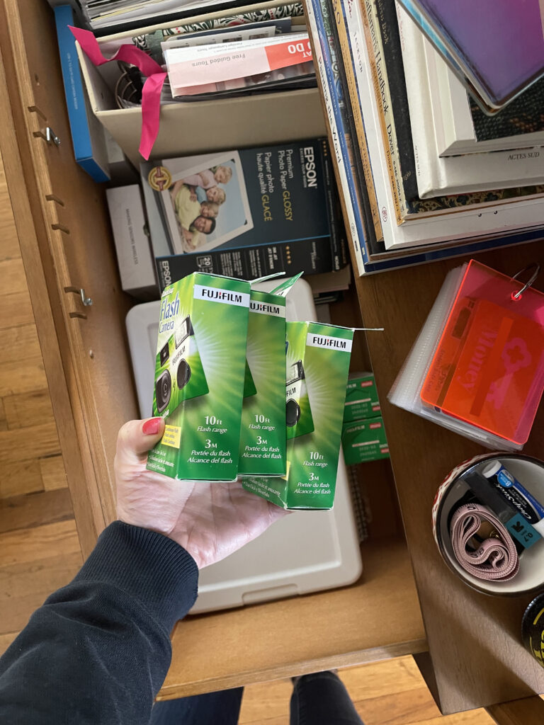
I’ve been wanting to do a film photography project for a while. I don’t have a film camera, nor can I afford one, and anyway I don’t know enough about photography to shoot on good film using a real camera and to get it developed. Not with these prices in this economy. What I do have are three 27-exposure disposable cameras, and what I do know is how to use them, and what I can afford-ish is to develop one (1) of them.

My disembodied hand holding three disposable cameras, still in their packaging, over an open drawer, in which they've been living for the last few years. Memorykeeping supplies and albums are in the bottom of the drawer.

These cameras are only (“only”) a few years old—I bought them in 2020 with the intention of using them to document the NINE coast-to-coast drives I made between DC-ish and Portland in 2020 and 2021—so I think the film’s still okay (?). We’ll see!

3. Photobooth photos

I love photobooths. Like, LOVE. Especially ones that still print black and white photos on film, which, sadly, seem to be nearing extinction. Still, whenever I see a photobooth, regardless of whether it prints in black and white or in color, or on film or is digital, I have to sit for a strip of photos. I don’t get the chance as often as I’d like—most photobooths here in the city are in bars and restaurants, two places that aren’t my scene. This year, I’d like to find some of the photobooths in the city that aren’t in bars and restaurants and sit for a strip of photos in each.

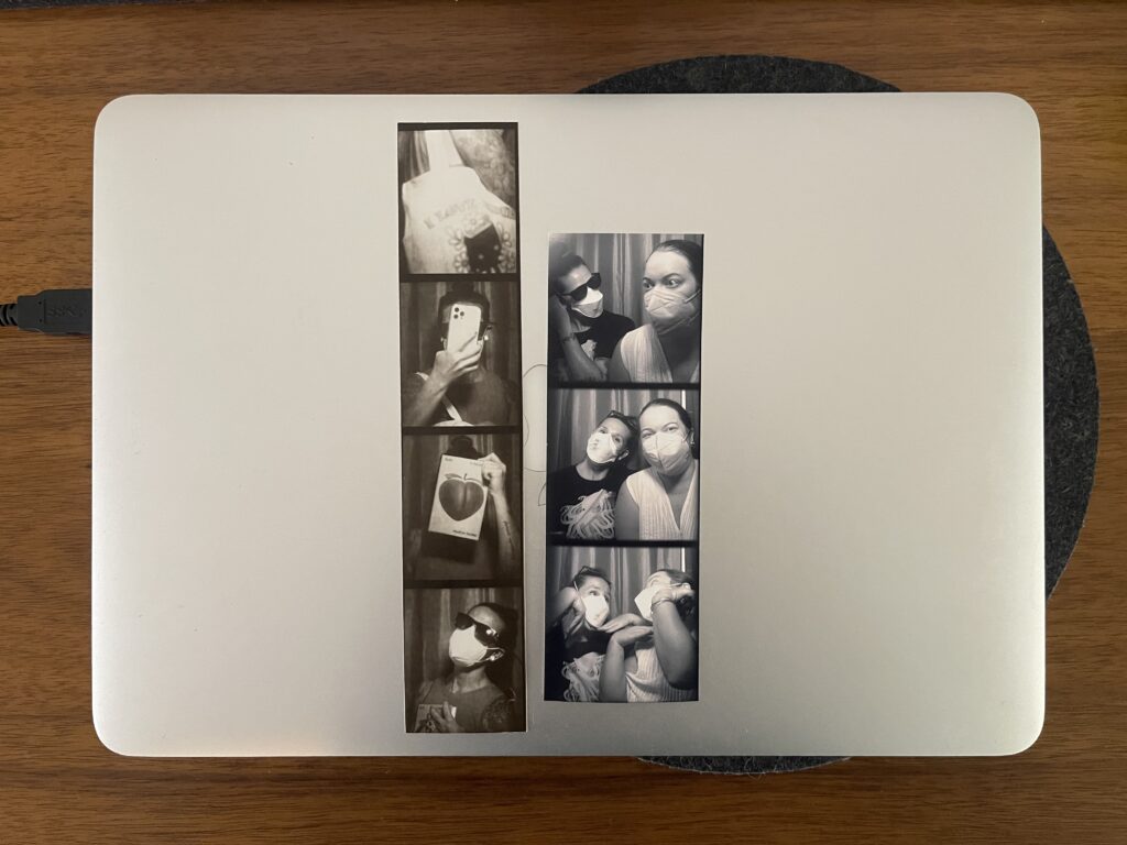
I know about the ones at Cargo (one of my favorite stores in Portland) and the Ace Hotel downtown. The one at Cargo hasn’t been there for quite some time (RIP)—more than a year, at least. The one at the Ace still prints in black and white, which I appreciate. Unfortunately, it’s no longer film, the color is different, the dimensions are a little weird, and it went up in price (though you do get two strips (different photos on each strip) instead of one now). Here’s a side-by-side of strips printed by the old Ace photobooth and the new one.

Two photo strips on top of a closed silver laptop. Both strips are black and white, though the coloring is different, as are the dimensions of the frames and number of frames per strip.

4. Portable scanner 

Last summer I saw this tweet of a New Yorker taking a portable scanner around the city. This type of project is extremely my shit. I think it’d be fun to do something similar.

5. Portland Movie Theater Project 

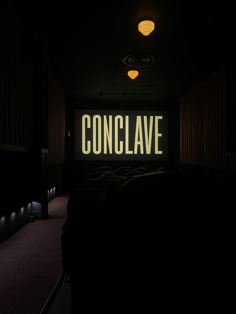
About six weeks ago, I, a person who cannot sit through a movie to save a life, decided I wanted to watch a movie in each of Portland’s historic or independently-owned movie theaters (there are 16 by my count). Initially, I planned to start in January. And then I changed my mind.

A small, historic movie theater is dimly lit by two beehive-inspired flush-mount light fixtures. The name of the movie, CONCLAVE, appears on the screen in a green-tinted light yellow font. The letters are tall and skinny, sans serif, and all-caps. The screen is flanked by curtains that appear to be a similar color as the title of the movie that's on-screen. A red carpeted walkway and the tops of empty seats are visible in the foreground.

I got started that week (Thanksgiving week) and knocked out four movies at four theaters before Sunday (Conclave was the first (and Sam Irby’s Instagram review of it made me laugh)). And then, in the weeks that followed, I saw two more movies at two different theaters. Six down, 10 to go.

6. Reread my favorite books from my youth

This was something I’d intended to do in 2024. Life had other plans. In the meantime, I’ve managed to get my hands on four of the five books on this list that I remember the titles of (I’m certain there are more than five books I loved while growing up, I just don’t remember them (it’s the trauma)). Once I have the brain space for this project, I just need to pick one up and start.

7. Sidewalk Joy Map

Portland has tons of Little Free Library-style installations, galleries, dioramas, and exchanges for all sorts of things: books, of course, and also handmade ceramics, keychains, mini art galleries, plants and seeds, puzzles, toys and trinkets, VHS tapes, yarn and other fiber arts supplies, etc., etc., etc. A bunch of them—more than 100 at the time of writing—are catalogued by the PDX Sidewalk Joy project. Once the weather is warmer and drier, I’d like to use the Sidewalk Joy Map and accompanying PDF, which includes descriptions of each of the locations on the map, to visit as many as I can this year, ideally by walking and biking around the city. (This is such an incredible project—a huge thank you to Rachel and Grant, the people who started it and keep it going.)

Old ID cards mini album

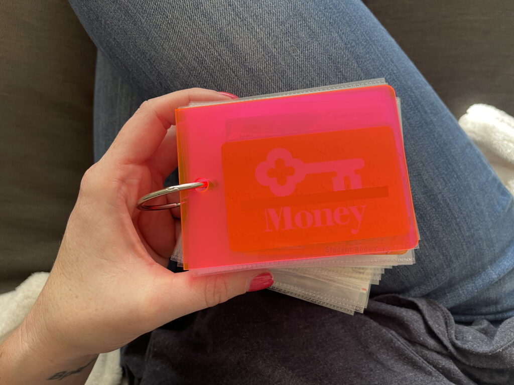
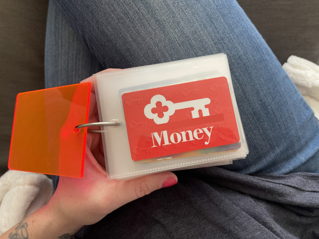
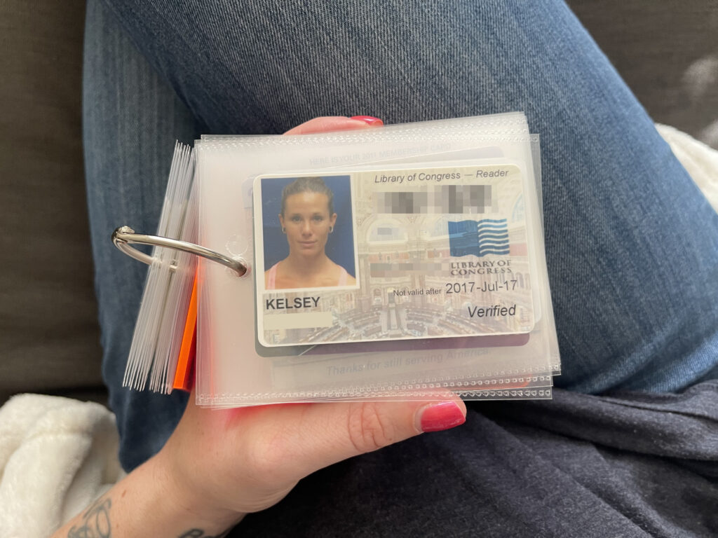
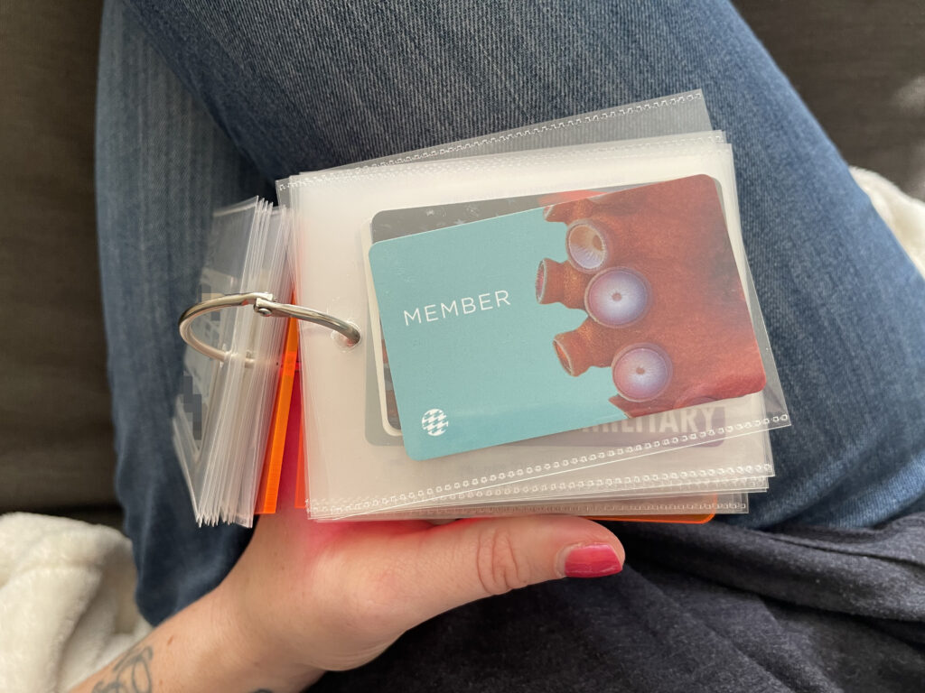
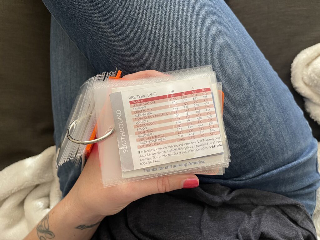
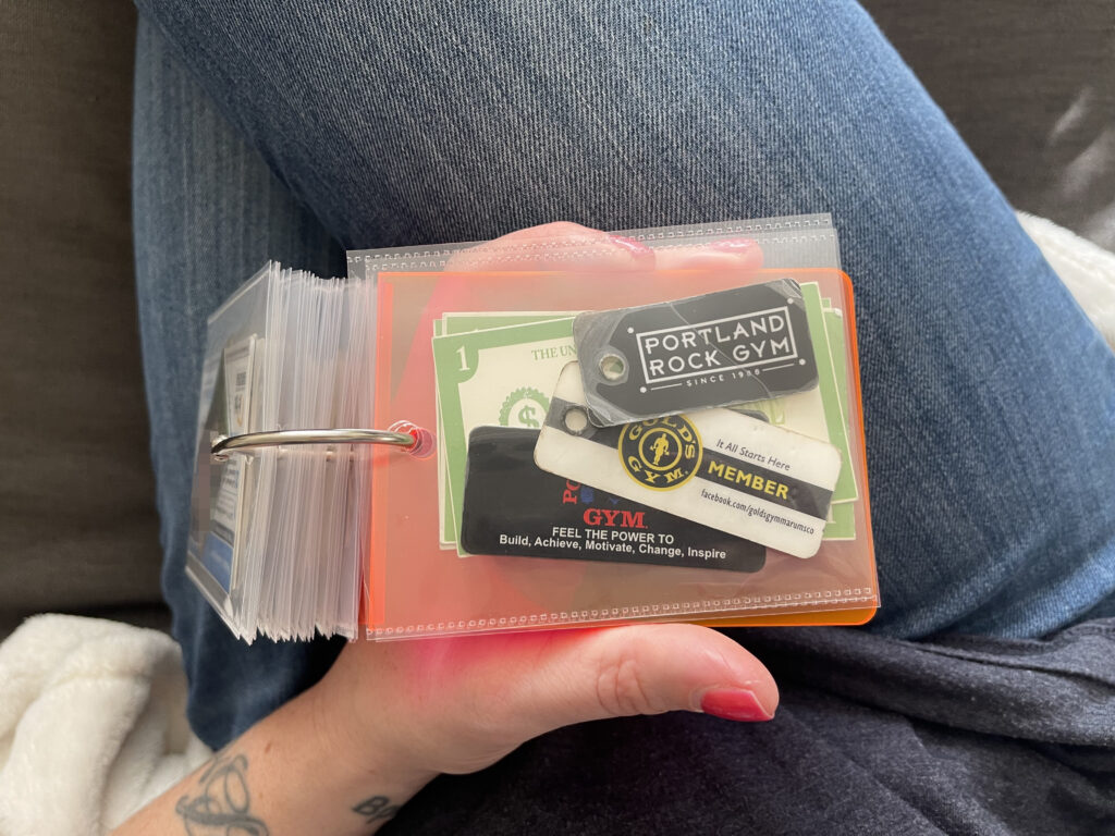
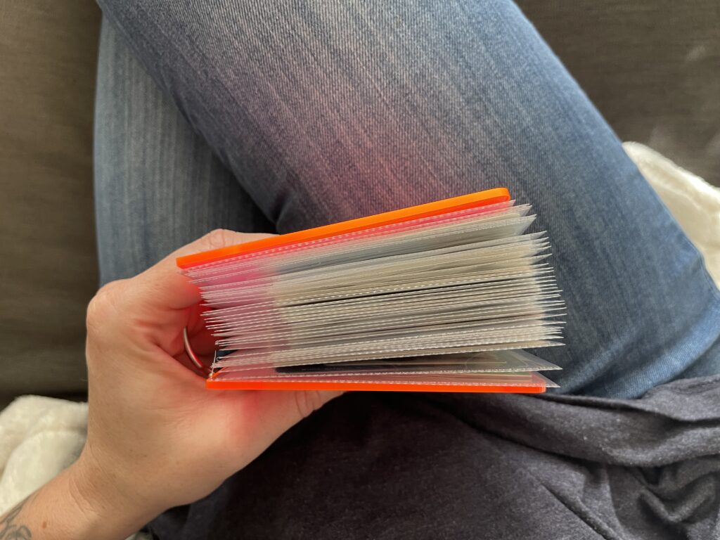
About a year ago, I was trying—again—to reestablish a regular memorykeeping practice. It just wasn’t working. I’d recently quit my job and was still in the thick of autistic burnout and passive suicidality. I didn’t have the brain space for a regular memorykeeping practice, and anyway I wasn’t doing anything aside from lying on my couch all day so there wasn’t anything to document. I wanted to do something, though. Something that took less effort and was basically impossible to fuck up. So I dug this acrylic album out of my stash and a stack of old ID (and similar) cards out of a container in my closet and made this very simple project.

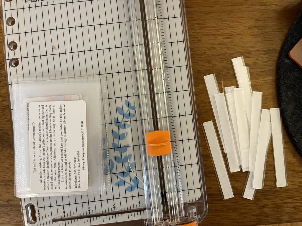
To secure the cards, I trimmed off the top part of Photo Flips and, using the album cover as a guide, punched holes in the top center of each photo flip. It’s all clipped together with a binder ring.

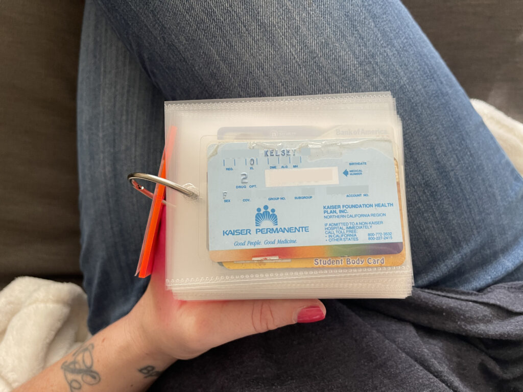
The whole project took maybe an hour. The most challenging and time-consuming parts were deciding which cards to include (all old school and work IDs and drivers licenses, select business cards, old membership cards, and other IDs and various cards that hold the most sentimental value) and in what order (mostly chronological).

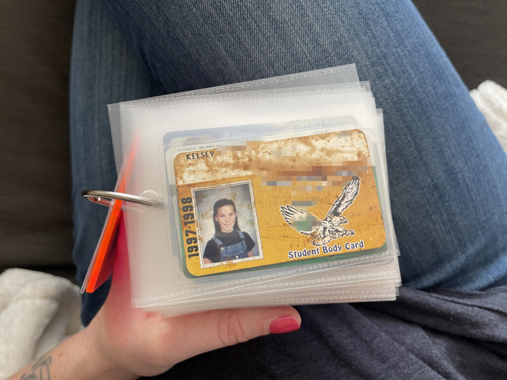
Many of the cards in this album are old school and work IDs and drivers licenses. Aside from the one school ID shown below, none of them are included in this post. I didn’t feel like doing the work required to block out all my personal information.

In addition to old school and work IDs and drivers licenses, I also included things like bank cards, health insurance cards, library cards (mine and my kids’), membership cards, neighborhood pool passes (RIP to living on the east coast where every neighborhood has an outdoor pool), National Parks annual passes, business cards (my own and others’), SmarTrip cards, the train schedule I kept in my work bag for the days I commuted by train, and key tags for some of the gyms I’ve belonged to.

Like my pandemic puzzles mini album, because this project is clipped together with a binder ring, it’s expandable so I can keep adding to it over time, which I love.

@tindertisements postcards

At the start of 2024, I wrote about three creative projects I wanted to work on throughout the year: I wanted to make a candle from the leftover wax of bunch of other candles of the same scent, I wanted to finish transcribing a 101-year-old diary I found a few years ago at a local vintage mall, and I wanted to do something fun with vintage photos I’ve been buying at various vintage stores and stalls and malls around town over the last several years.

I made the candle (and did not enjoy it), I finished transcribing the diary (and absolutely loved it, as well as all the rabbit holes and field trips the project took me on along the way), and, in a true Christmas miracle, I’ve done something fun with the vintage photos I’ve been buying at various vintage stores and stalls and malls around town over the last several years. I present to you, the inaugural (and perhaps only-ever) set of @tindertisements postcards.

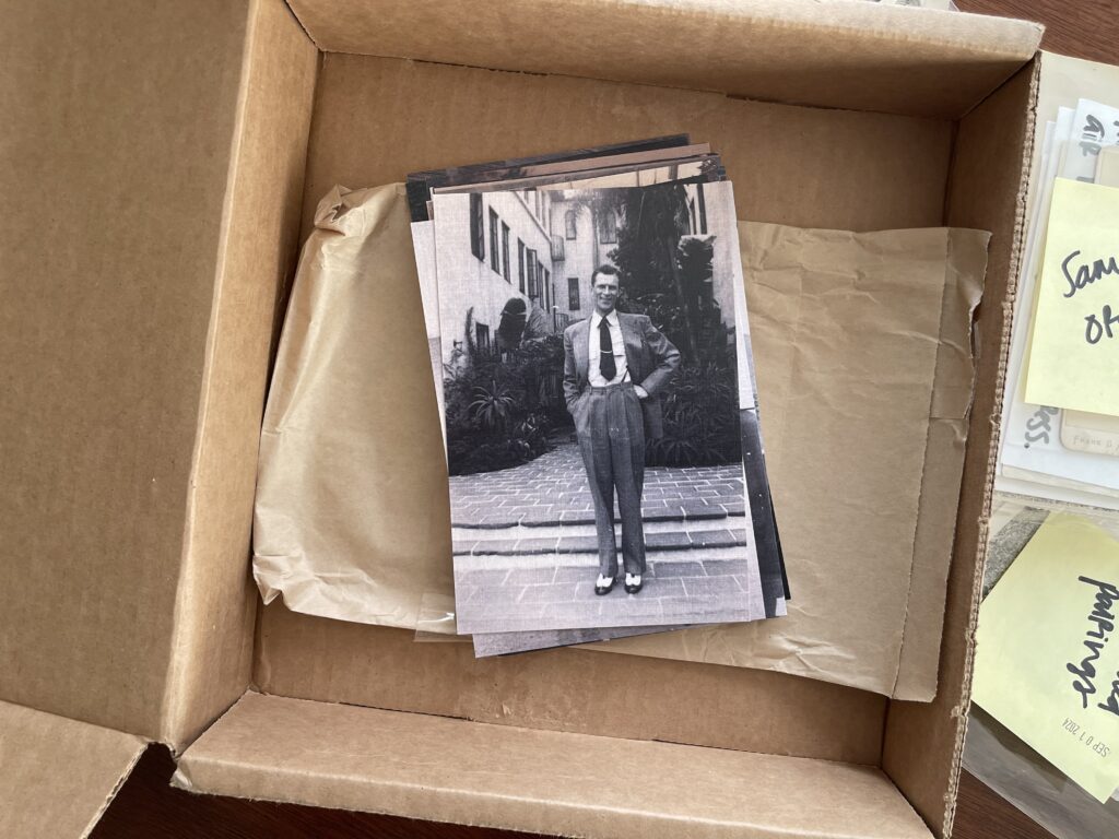
A stack of linen postcards sit face up in an open shipping box. Only the top postcard is fully visible. It features a digitized black and white vintage photo of a man dressed in a suit and snappy shoes. His jacket is unbuttoned. One hand is in a trouser pocket, the other on his hip. His head is slightly cocked to one side and he's smiling.

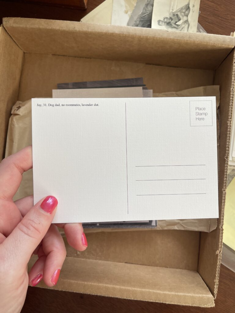
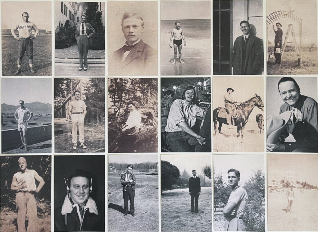
On the front of each postcard, a digitized vintage photo. On the back, a short dating app bio—or portion of one—that I thought was fun and/or funny and/or clever. Most bios are exactly as I found them; some have been lightly edited for capitalization and punctuation.

The back of the postcard in the photo above. In the top left corner it reads, "Jay, 31. Dog dad, no roommates, lavender slut."

This project started almost four years ago on Instagram. I named it @tindertisements—the vast majority of the bios are from Tinder, and dating app profiles are the modern iteration of the hundreds-of-years-old personal advertisement. The Instagram approach quickly fizzled out; I don’t spend a lot of time on the platform, and I wanted to do something with this project that I could hold in my hands. I’m a big fan of both snail mail and quality paper-crafted goods (and also one-of-a-kind items). Postcards just made sense.

A grid of 18 vertical postcards. All feature a digitized black and white photo of a white man.

A closer look at a few of the pairings:

On the left, the front of the postcard: a buff, shirtless man stands on a beach, his hands at his side. Hotels and palm trees are in the background. On the right, the back of the postcard: in the top left corner it reads, "Brett, 27. Send me drunk texts at 2 am so I know it's real."
Brett, 27. Send me drunk texts at 2 am so I know it’s real.
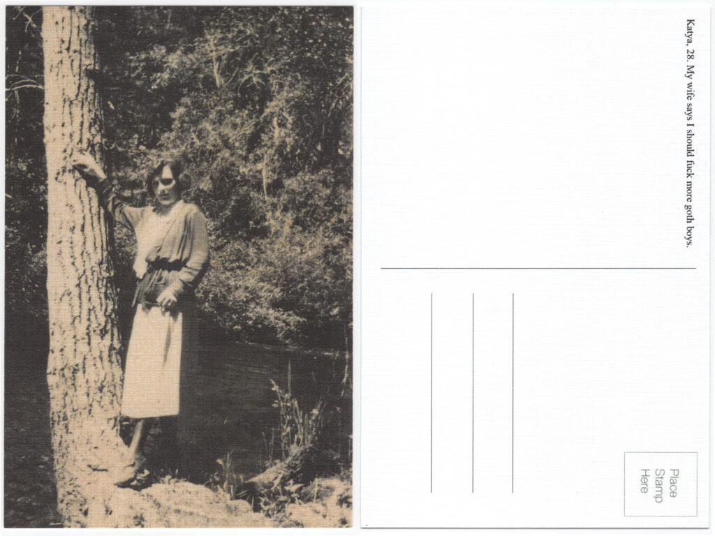
On the left, the front of the postcard: a woman in a long-sleeved dress stands near a tree. A body of water and bushes are behind her. One arm is up on the tree, the other is against her body. On the right, the back of the postcard: in the top left it reads, "Katya, 28. My wife says I should fuck more goth boys."
Katya, 28. My wife says I should fuck more goth boys.
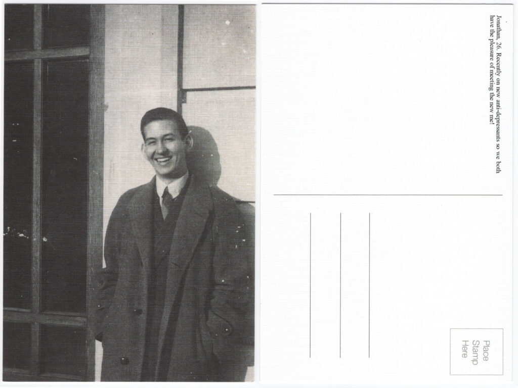
On the left, the front of the postcard: a man wearing a suit, an overcoat, and a big smile stands against a building. On the right, the back of the postcard: in the top left it reads, "Jonathan, 26. Recently on new anti-depressants so we both have the pleasure of meeting the new me!"
Jonathan, 26. Recently on new anti-depressants so we both have the pleasure of meeting the new me!
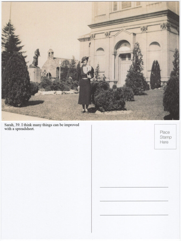
On the top, the front of the postcard: a woman stands in front of what appears to be a church. She's in a dark long-sleeved dress and wearing a fancy hat with a large brim. She holds a clutch at her chest. On the bottom, the back of the postcard: in the top left it reads, "Sarah, 39. I think many things can be improved with a spreadsheet."
Sarah, 39. I think many things can be improved with a spreadsheet.
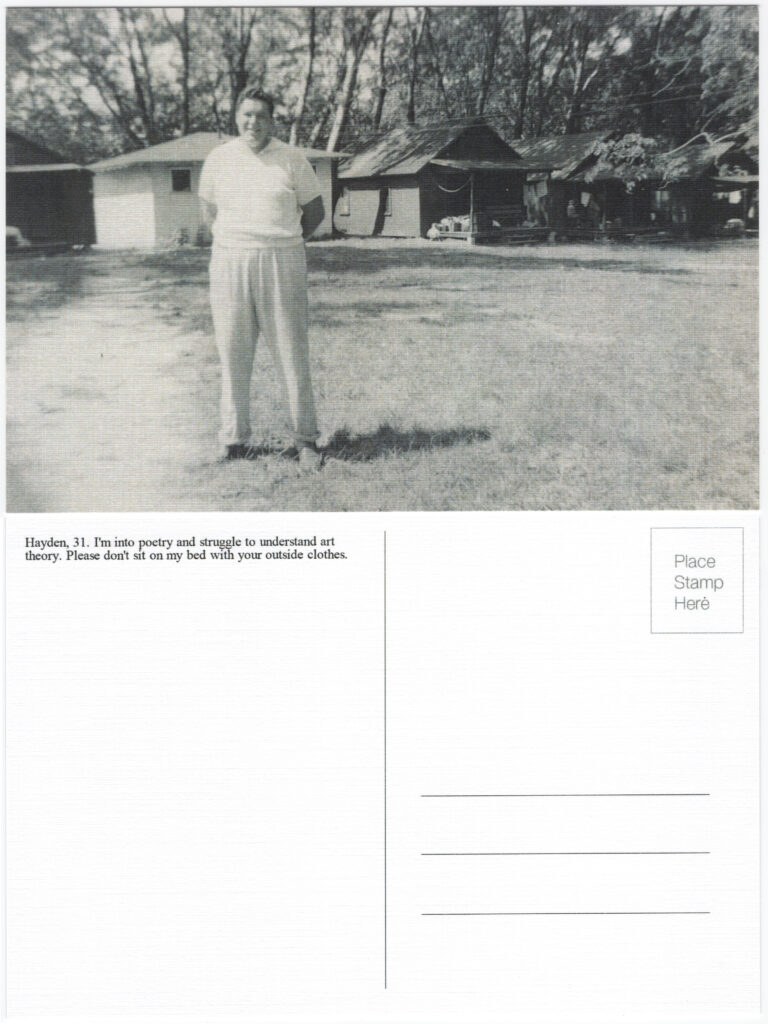
On the top, the front of the postcard: A man stands dressed in casual (for the day) clothes, his hands clasped behind him. He's smiling. Behind him, structures that appear to be camping cabins. On the bottom, the back of the postcard: in the top left it reads, "Hayden, 31. I'm into poetry and struggle to understand art theory. Please don't sit on my bed with your outside clothes."
Hayden, 31. I’m into poetry and struggle to understand art theory. Please don’t sit on my bed with your outside clothes.

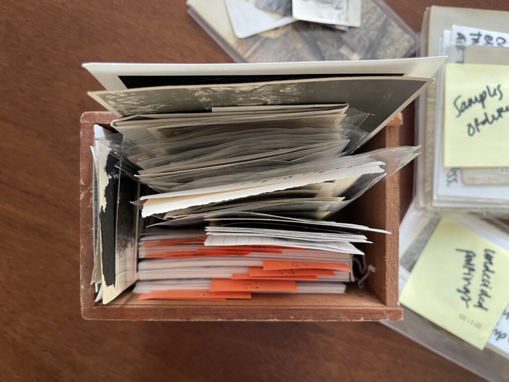
While I haven’t counted how many bios and photos I have in my collection, I’m pretty certain I have at least 100 of each. Part of my collection lives in an old cigar box (another vintage mall find) on one of my bookshelves.

A vintage cigar box filled with 3x5 cards and vintage photos.

Not all of the photos and bios are paired. Pairing old photos of people from many decades ago with contemporary names and personalities and matching the ages as best you can is a humbling art that takes a ton of time and patience and practice to get good at (I’m still learning). (It’s also quite challenging, it turns out, to find vintage photos of men wearing something other than a military uniform, of people in poses other than standing straight in front of the camera or sat in portrait mode, and of people who aren’t white.) Of the photos and bios that are paired, not all of them became postcards—many of the photos simply aren’t the right dimension. Many more of the not-yet-paired photos will suffer the same fate for the same sad reason. RIP.

There are 33 postcards in the set. I ordered two sets. In one set, the photos are as they were scanned in, have the same font size and placement on the back of every postcard in the set, and are all linen postcards. With the other set, I played around with different levels of contrast with the photos, different font sizes and placements on the back (which you can see in the five examples above), and different paper finishes (matte, pearl, etc.). I made a spreadsheet to keep track of all the different combinations so if I end up ordering any given postcard again, I can make sure I’m using the contrast level, font size and placement, and paper finish that I like best.

Many of these postcards became gifts. I sent a chonky stack of them to my friend and former roommate, who’s been along for the ride since the very start of this project (we lived together during the first year of this project—she joined me on several of my photo-hunting shopping trips and still helps me decide on pairings I’m stuck on, and she’s who’s sent me the glass I used for the candle I made). Like me, she also loves snail mail, quality paper-crafted goods, and one-of-a-kind items. I know she’ll enjoy sending these postcards to folks in her life (or saving them for herself). A few more will go to other faraway friends to whom I’ve sent a few pieces of random happy mail throughout the year each year since the start of the pandemic. The rest will continue to hangout at home with me and their siblings—my greeting card collection—until I have reason to send or gift them.

* * *

This project was hugely inspired by Minor Phrases, an old Tumblr project that has also found a home on Instagram, and much of Sophie Calle‘s work, especially her 2020 piece On the Hunt (an archived version of the original article on the piece, which features more images of the actual work, is here).

Additional related reading: 15 amazing personal ads from the ’90s, a Longreads essay on the evolution (through the mid-2010s) of the personal ad, and one editor’s favorite London Review of Books’ personal ads.

My “Why didn’t I think of this!!!” list

In my phone I have a note titled “Why didn’t I think of this!!!” It’s a list of creative projects that I (1) think are clever, fun, and smart, (2) wish I’d thought of, and (3) find inspiring and generative. Today I’m sharing some of the projects on that list here.

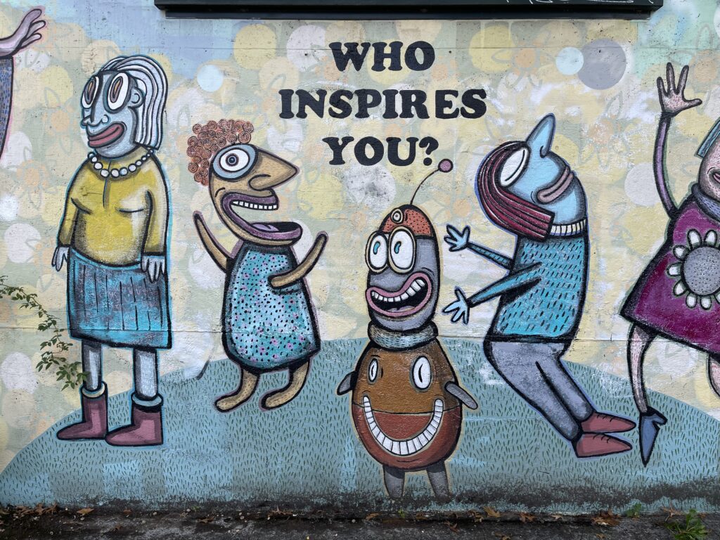
A mural painted on the side of a SE Portland neighborhood of caricatures of people that kind of look like cute monsters. The question WHO INSPIRES YOU? is painted in all caps above them.

Food diaries and a cookbook

Leaked Recipes by data researcher Demetria Glace (photography by artist Emilie Baltz) is a cookbook of more than 50 recipes—and the stories behind them—that were found in some of the world’s biggest email leaks (Enron, Hillary, Pizzagate, Wikileaks, etc.). Genius. Though it’s useless to me on a practical level as a stereotypically extremely picky autistic eater, I wish I’d bought the book when I had the money to.

Sylvia Plath’s Food Diary, a Twitter account—curated by writer Rebecca Brill (who also runs @sontagdaily) and illustrated by painter Lily Taylor—that tweets “everything sylvia plath ate according to her journals, letters, poems, the bell jar & other texts.” That’s literally it. No added context, just excerpts. Love. For more about the project: an interview with its curator.

What I Ate for Lunch and Why, a blog that documents almost every lunch the blogger behind it ate from May 2008 until early December 2015 (and a few entries from 2017 thrown in). Extremely my shit. As the type of autistic who eats the same thing prepared the same way eaten out of the same container or off the same plate using the same silverware while sitting in the same spot at the same time every single day for months and months and months on end before switching things up, the sheer variety of foods eaten is impressive, fascinating, and incomprehensible to me.

What She Ate: Six Remarkable Women and the Food That Tells Their Stories by Laura Shapiro is a fantastic idea for a biographical essay collection. I love an oblique and unexpected angle into history.

Memoir-ish and adjacent writing

Cognitive Behavioral Therapy While Running” is a hermit crab essay by writer Megan Williams. A hermit crab essay is one that takes on an existing form or structure of another type of writing. In this case, Meg’s essay is written in the form of a CBT worksheet. So, so good. (Here is an archived version of it, in case Twitter dies or doesn’t let you see it without logging in or creating account.)

I love little glimpses into other peoples’ lives so naturally I love the classifieds. Over the years, I’ve read a handful of books and articles on the history of the classified ad, and a few pieces of work wherein the writer interviews the people behind the items they list in the classifieds. No one does it better than Miranda July (website, Instagram, Substack) in It Chooses You (I love everything she makes). In the book, a project she took on while procrastinating on another, she and photographer Brigitte Sire travel around Los Angeles, interviewing and photographing “a random selection of PennySaver sellers, glimpsing thirteen surprisingly moving and profoundly specific realities, along the way shaping her film, and herself, in unexpected ways.” A dream project.

Illustrator Carson Ellis‘s latest, One Week in January: New Illustrations for an Old Diary, is one of my favorite projects of the year. In it, she pairs new illustrations with an old diary that she kept for only a week before abandoning it—the year was 2001 and the entries document her first week in Portland as a young artist living with other artists/friends in a warehouse in southeast. I’m such a sucker for stuff like this. Sadly, I missed her author talk at Powell’s. Happily, I made the opening reception of her show at Nationale, which featured original paintings of the art in the book (sadly, I left way earlier than planned because my social and sensory batteries ran out way faster than anticipated). More about the project and an interview with Ellis here.

If you grew up in the 90s with AOL chat rooms and AIM and also enjoy peering into the private parts of peoples’ lives, you’ll probably love People I’ve Met from the Internet by Stephen van Dyck as much as I do. The book is a memoir—in the form of a very long annotated list—of his sex life as a gay teen on the early internet. It’s one of my all-time favorite projects. The concept and material are just so good—and similar-ish to a project that I’ve had in the works since 2017, which also draws inspiration from Sophie Calle’s True Stories, Carmen Maria Machado’s Inventory, Emily Spivack‘s book Worn Stories, and The Museum of Broken Relationships.

Pixel art

This Google Sheets pixel art by artist and creative director Kara Haupt blows my mind. I’m endlessly impressed by people who have a brain that works like this because mine does not (or at least, it has not yet), even when I’m given a pattern or instructions to follow.

I’m also deeply in love with Diane Meyer‘s work, in which she stitches pixelated squares directly onto photographs. Her entire portfolio is incredible. I especially love the scenes from Berlin and the 1970s class photos. (Meyer’s work reminds me of Anna Von Mertens‘s project “As the Stars Go By,” in which she hand-stitched onto large swaths of black cotton the star rotation pattern at different violent moments in history (Wounded Knee, Hiroshima, the assassination of MLK Jr., 9/11, bombings of Baghdad, etc.).)

Security envelope patterns

I can’t get over this curated collection of security envelope patterns. Hoping to craft something similar (I haven’t—yet), I started collecting security envelope patterns earlier this year after seeing a memorykeeper whose work I love used a cut-out from one as the title page for a mini album she made back in 2016 (she took her projects offline years ago and I don’t see an example of it anywhere on Pinterest so I can’t link to it, sorry!). When I saw the zine-like project I almost died. Both ideas are impossibly cool and creative.

My all-time favorite home tour

Years ago, Austin Kleon shared a link to a home tour with writer Olivia Laing. It immediately became—and remains—my all-time favorite home tour; it’s a comfort video for me, and I return to it often. The place is incredible. Full of art and books and beautiful and sentimental objects and ephemera, it just feels so cozy and eclectic and loved and lived in. It feels, too, very authentic to its inhabitants. And that English garden/yard—be still be still be still, my heart. It’s giving whimsy. It’s giving cottagecore. It’s giving Secret Garden.

Did you catch the part where she talks about her home being a love story? As an autistic who spends much of my life at home, where I have far more control over the sensory and social environment than I do outside of the space, I love this idea—and its sibling idea: your home can be a love letter to your life.

What I’m working on: December 2024

For the first time in years and years—and just in time to discover the memorykeeping industry as I previously knew it has all but disappeared—I’ve got a whole bunch of memorykeeping projects in the works. Perf! Here are four that I’m hyperfocused on right now.

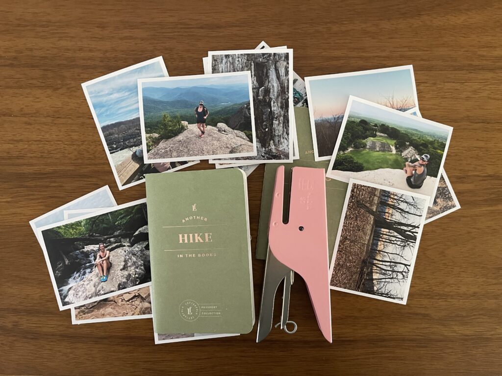
Hike Passport

This Hike Passport is from Letterfolk. It is, of course, no longer listed on their website. They do still have the kids version and a handful of other Passports listed, though.

An overhead view of a pocket-sized, green-covered Hike-themed passport atop my wood desk, surrounded by 3-inch by 4-inch photos of me taken during different hikes and a pink mini stapler that looks kind of like a whale.

Each pocket-sized booklet has room for 20 entires. The left side of each spread is a little “form” that you fill out with information about the hike—trail name, distance, the day’s weather, any wildlife you saw, who you went with, etc. The right side of each page is blank (well, it’s printed with a dot grid) for you to do with it what you will: make a sketch, journal, affix a photo, etc. I decided to include a photo from each hike with its entry.

I’m waiting for the latest batch of photos to arrive before I share more of this project here. (I print many of my photos at home and order professional-quality ones only for special projects (I use Persnickety Prints).)

* * *

Holiday mini flip album

In the memorykeeping world there’s an annual holiday project that a bunch of people take on. It’s called December Daily (more here and here and here) and it’s brought to us all by memorykeeping OG (and fellow Oregonian!) Ali Edwards (also here and here) and her creative team.

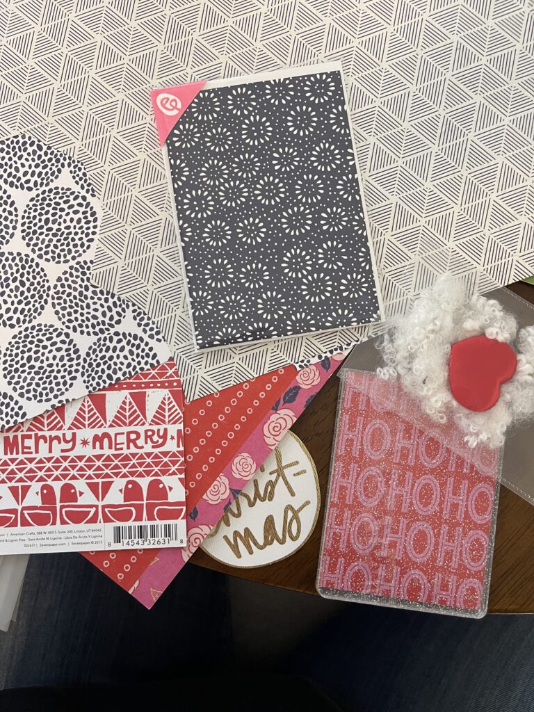
An overhead view of a stack of holiday-themed and -patterned scrapbook paper arranged on my dining table.

I do not participate in December Daily. I never have. I’ve tried—lots of times. It’s just never worked out. This is partly because I’m not a big holiday person and so generally don’t feel connected to the premise of the project. And it’s partly because my brain struggles real hard to do a daily themed project and not have each day’s “entry” be from that actual day.

(The way most people, including Ali, approach this project is to tell 25 to 31 different stories throughout the month (many people document only through Christmas Day; some through the end of the month), regardless of whether the story they’re documenting happened on the day of the month that corresponds to the number used in the album. My brain does not work like that.)

Still, I love—and I do mean LOVE—looking through everyone else’s December Daily projects. And still, there is one annual holiday tradition I do with my kids that I want to document. This will be that project. I’m very excited to get the photos back and put it all together.

* * *

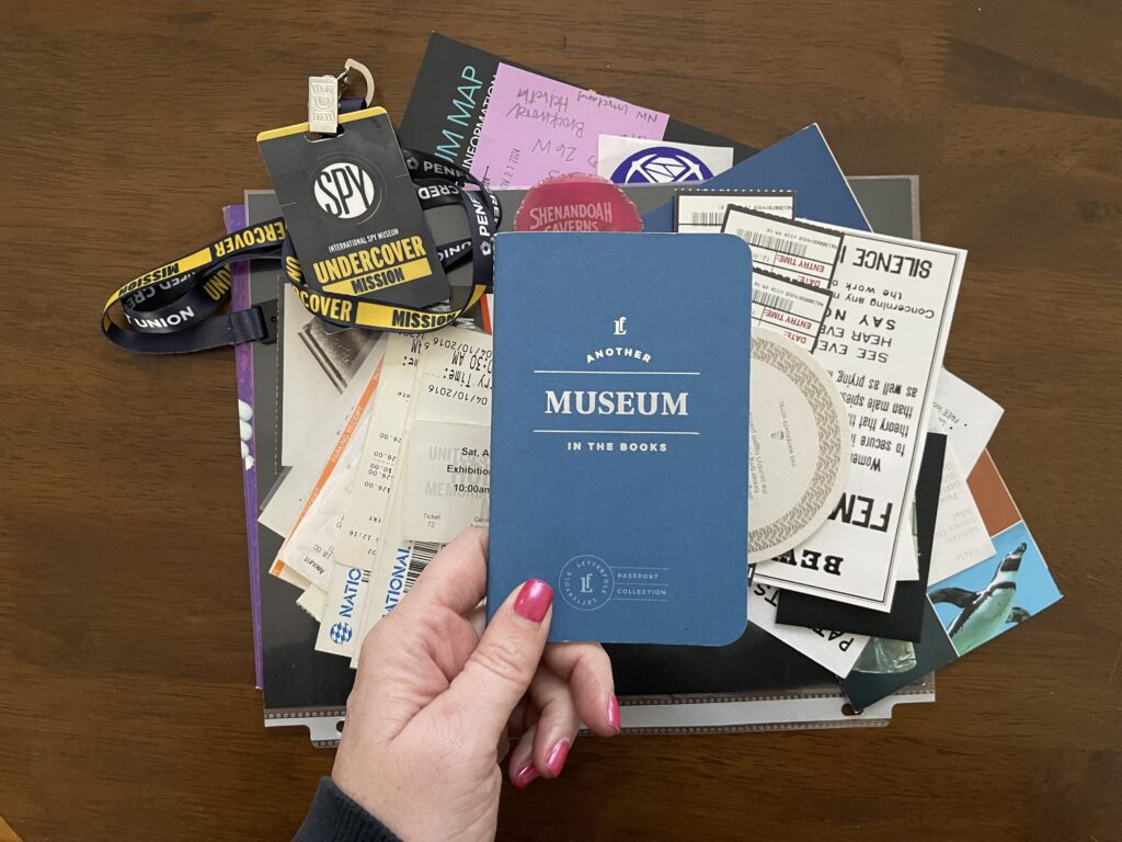
Museum Passport

Another Letterfolk product. Unlike the Hike Passport, the Museum Passport is still available on their website (for now).

My disembodied hand holds a small, pocket-sized, blue-covered Museum-themed "passport" over a stack of ephemera collected from museums I've visited over the years.

Like with the Hike Passport (and all the others in the collection), each booklet is pocket-sized and has room for 20 entries. The left page of each spread is a little “form” you fill out with details about each entry—the name of the museum, the type of museum, admission cost, favorite pieces, etc. The right page of each spread is blank-ish (printed with a dot grid) for you to do whatever you want there. I chose to include a photo from each visit with its entry.

I’m working backward with this project, which is not my preferred way of approaching a memorykeeping project. It feels easier and less stressful to me to keep up with projects in real time. That isn’t always possible, and that’s okay. I do what I can with what I have and where I’m at.

I finished all the legwork for this project the weekend before Thanksgiving and placed an order the other day for the photos I’ll be including with each entry. I look forward to sharing more of this project here once I’m caught up with it all.

* * *

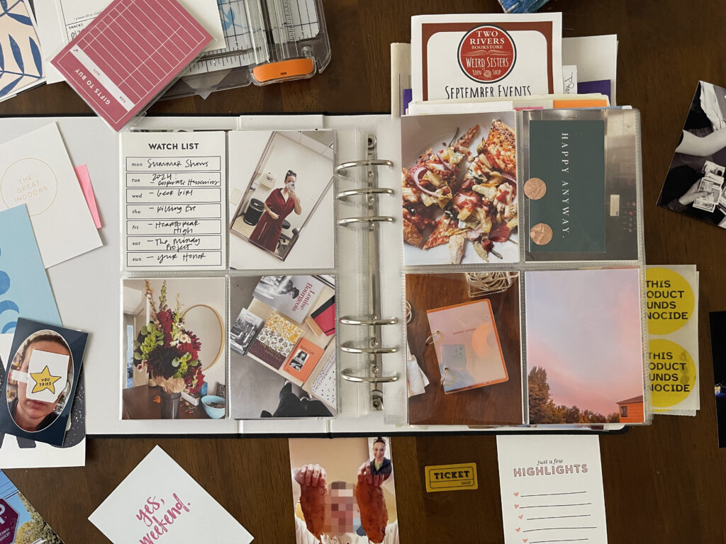
Yearly memory album

This style of memorykeeping—which is basically a physical Instagram grid with some collage-style elements and techniques added in here and there—is also known as Project Life, modern memorykeeping, and pocket pages-style scrapbooking or memorykeeping. It’s been my go-to memorykeeping approach since I first learned about it circa late 2011/early 2012. In recent years—since 2020, really—I haven’t been as consistent with it as I was in earlier years. The pandemic and the halt to life as we knew it that it brought are only partly to blame. A pre-pandemic major and unexpected life event is also to blame, as are mental illness and the lack of space there is to store my supplies and work on my projects in the apartment I’ve lived in for the last four years.

A six-inch by eight-inch photo album, open and face up on a table. On both the left and rides sides are a page protector partitioned into four three-inch by four-inch pockets, each filled with a photo or a card with journaling on it.

Nevertheless, she (I!) persisted: I’m pleased to announce that since July of this year I have fully been back on my bullshit and have kept up with documenting the days and weeks and months in this 6″x8″ album. I’d like to share more spreads here on the blog whenever the dreary Oregon sky that dominates this time of year gives me some photo-friendly lighting to work with. Don’t hold your breath.

A six-inch by eight-inch photo album, open and face up on a table. On both the left and rides sides are a page protector partitioned into four three-inch by four-inch pockets, each filled with a photo or a card with journaling on it.

I’m the opposite of pleased to announce that I’m not sure how I’ll continue this practice (my main memorykeeping practice!) going forward—I’m almost out of room in this album and the brand that sold these albums (and the corresponding page protectors) recently pivoted to selling office stationery (sticky notes, desk calendars, notepads, etc.). It’s a brand “refresh” that I’m not alone in feeling deeply confused and disappointed by. Here’s hoping I can figure out how to keep at this project in 2025 and beyond.

My 2025 to-do

I don’t make new year’s resolutions. Instead, I make a new year’s to-do list comprised of a single, massive undertaking. Then, I break the overall undertaking into smaller and smaller groups of tasks, order them hierarchically, and work away at it all, bit by bit, until the project is done (or I give up).

My 2024 to-do was “get my affairs in order.” You know, estate planning. I have neither an estate to speak of nor plans nor a desire to become incapacitated or die any time soon. Even so, I’m a single parent with no family and few friends (and none who know me well enough or live close enough to take over if I were to become incapacitated or die any time soon) and a history of mental illness. Plus, there’s the ongoing COVID pandemic, the likely incoming bird flu pandemic, and climate collapse. So, even though I don’t have plans or a desire to become incapacitated or die any time soon, I recognize that these things are not, ultimately, in my control, and I made it my mission this year to plan as best I could for the inevitable.

This was a deeply uncomfortable undertaking. It was also an important and necessary one. After a year of difficult work—I had to stop and take weeks-long breaks several times throughout the year because thinking about these things often triggered my OCD (existential subtype) and derealization, and the administrative aspect of estate planning is not compatible with my autistic executive dysfunction—I managed to check this to-do off my list at the eleventh hour (yesterday!). Thank fuck.

In 2025, I want to tackle my digital photo and video organization and storage. Like 2024’s to-do, this will be a massive undertaking. I anticipate it will also be massively frustrating at most points and massively rewarding and helpful once it’s complete. (I’ve been trying (“trying”) to tackle this task since, like, 2018 as part of a larger digital decluttering project I’ve been very slowly chipping away at. It has always felt too overwhelming. Getting my affairs in order also felt incredibly overwhelming and I managed to do it anyway. I’m hoping the sense of achievement and ability that crossing that to-do off my list gave me helps me finally get to the finish line with this project, too.)

I’m not yet sure how I’ll approach this thing because I haven’t yet completely mapped out the project. I do know that my first steps will be to figure out where all my digital media is, and then, before I start fucking around with it, back it all up.

Completing these two steps will be challenging considering several of my memory cards are missing or lost (RIP), a not insignificant amount of media (about eight years’ worth) is saved locally on an old laptop that I don’t currently have physical access to (it’s in a co-parent’s garage, thousands of miles away) and may not actually even work anymore, my old Dropbox account isn’t downloading/exporting files correctly (and their support team can’t figure out why), and I have a bevy of photos that now exist only online with photo storage services I don’t remember the names of and maybe don’t exist anymore. And then there’s the headache of the media that I do currently have access to, which, at roughly 130,000 photos and videos, is beyond overwhelming.

Eventually, this undertaking will also involve distinguishing iPhone media from GoPro media from “real” camera media (this is something that is important to me right now; it may not be once I get going with this project); going through all my screenshots and probably deleting most of them; figuring out offline backup solutions; and drafting a README document that explains where everything is and how it’s organized so that when the time comes my kids can easily find what they’re looking for.

The end result of this project doesn’t need to be perfect. It just needs to work better than what I’m doing now: Whatever the solution, it should be able to adapt to changes (as best as can be anticipated) in technology, our access to it (I am deeply concerned about the future of the internet), and how we use it; it should be able to adapt to my needs; it should include both on- and offline redundancy; and it should be easy and economical to use, maintain, and back up. Data privacy and security, especially in regard to (1) citizen surveillance and (2) customer data being used to train AI, is also very important to me. Unfortunately, both of these things seem ultimately unavoidable.

Because this to-do overlaps so heavily with the types of things I’ve shared so far here on the blog—memorykeeping, other creative and creative-ish projects, small adventures I take (or find) myself on—I’m sharing about it here on the blog, too. Partly to help myself stay focused on this monumental task, and partly in case it’s the push someone else needs to get going—or pick back up—with their own similar effort. Progress report to come.

Pandemic Puzzles mini album: An update

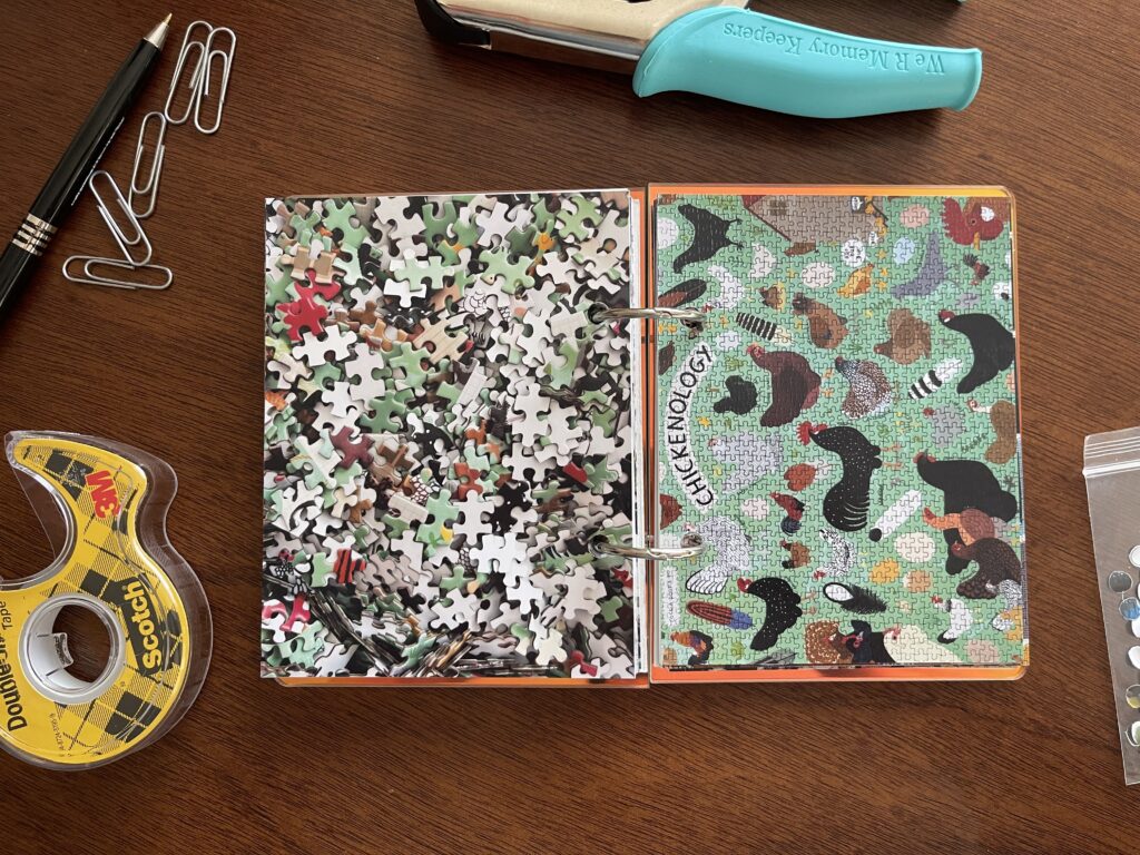
Over the weekend I added photos for five additional puzzles to my Pandemic Puzzles mini album. I messed up on the very first one 😬.

Spread #1. The left-hand page is a photo of the puzzle's unpuzzled pieces. The right-hand page is a photo of the completed puzzle of illustrations of different chickens.
Chickenology by Princeton Architectural Press. 1,000 pieces.

Ideally, the right-side page should be flipped so that “chickenology” is on the edge, facing in. The thing is, there was…a wildlife situation happening on the roof of my apartment building when I was putting these pages together. It was extremely loud and distracting (and, at times, sounded kind of like chickens). I would’ve gone outside to get a better idea of what was happening (I was watching it as best I could via the reflection in the top-floor windows of the building across from mine) if there hadn’t also been an aggressive and likely rabid raccoon terrorizing tenants in our parking lot. It was an eventful holiday over here (and, quite frankly, the most excitement in my life all year). Anyway. I was distracted by all the chaos and I messed up. Oh well.

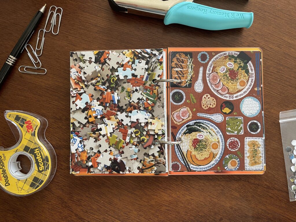
I bought this ramen puzzle at Two Rivers/Weird Sisters, a super cute combination book store/yarn shop in North Portland’s St. Johns neighborhood. If you’re planning a visit to Portland, I highly recommend checking this place out while here. (Hound & Hare, a vintage shop a few blocks over, should also be on your St. Johns list of places to visit.)

Spread #2. The left-hand page is a photo of the puzzle's unpuzzled pieces. The right-hand page is a photo of the completed puzzle of an illustrated overhead view of two bowls of other ramen and other sides and foods.
Late-Night Ramen by Smith Street Books. 1,000 pieces.

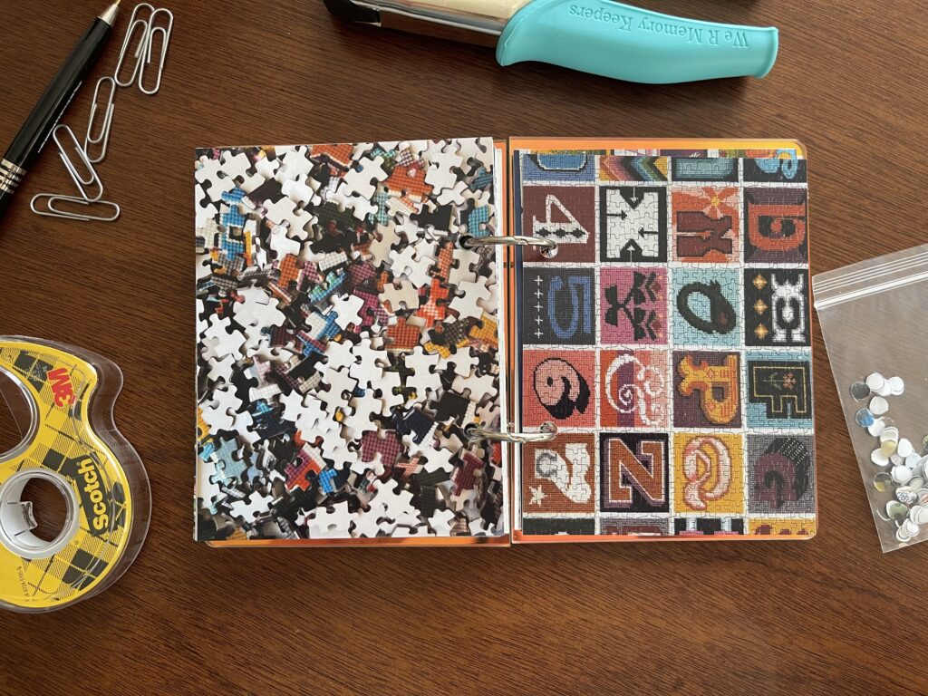
I picked up this needlepoint puzzle (and a holiday-themed one I haven’t started yet) in October at Portland Puzzle Exchange‘s monthly event. It was my first time attending. There was a live band, free refreshments, and a lot of people—the line was through the community center that it’s held in, out the door, and down the block. It was sensory and social overload.

Spread #3. The left-hand page is a photo of the puzzle's unpuzzled pieces. The right-hand page is a photo of the completed puzzle of needlework letters and numbers in a grid pattern.
Needlepoint A to Z by Galion. 1,000 pieces.

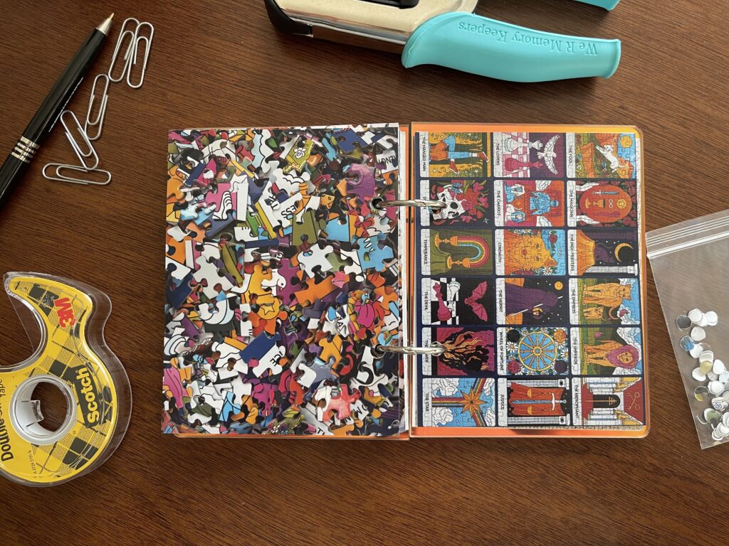
This tarot card puzzle is double-sided, which I didn’t realize until I got home and was a little annoyed about. I thought it would make doing the puzzle unenjoyably challenging. Fortunately for me, both sides of the puzzle pieces were coated differently, which made it easier to distinguish which side of any given piece was the side I needed.

Spread #4. The left-hand page is a photo of the puzzle's unpuzzled pieces. The right-hand page is a photo of the completed puzzle of various cards from the tarot's major arcana, arranged in a grid.
Major Arcana (double-sided) by Galison, 500 pieces.

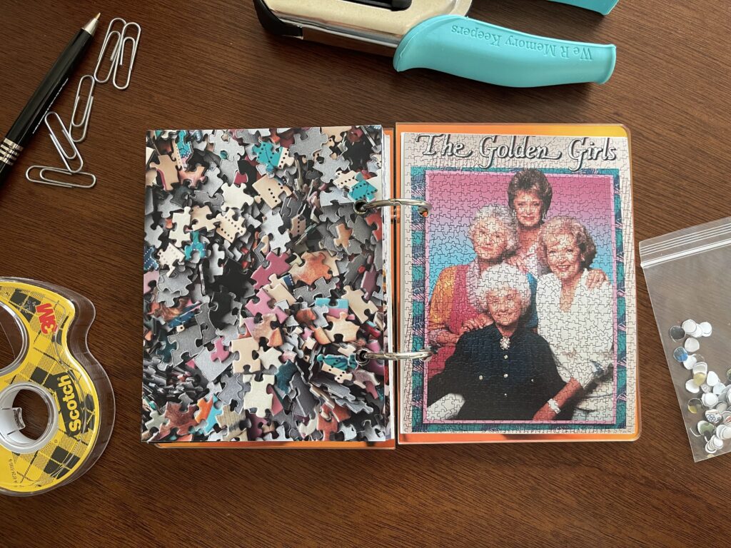
This Golden Girls puzzle was more challenging than I expected. Some of the pieces have a “normal” puzzle cut, some of them are shaped really strangely. The hair was the hardest part.

Spread #5. The left-hand page is a photo of the puzzle's unpuzzled pieces. The right-hand page is a photo of the completed puzzle of The Golden Girls seated for a portrait a la 1980s JC Penny-style photos.
The Golden Girls by USAOPOLY. 1,000 pieces.

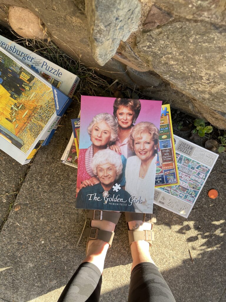
This puzzle was a very unexpected and fun find—I walked into it on the sidewalk while on my way home one afternoon. It was with a stack of other puzzles, left beneath a Little Free Library in the neighborhood. Incredibly, no pieces were missing.

A stack of piles on a neighborhood sidewalk. The Golden Girls puzzle is on top.

It’s not uncommon to find free piles around the city. Portlanders (myself included) leave out all sorts of things—in various states of condition, and in various types of containers (or no container)—for others to take. There are almost always several free piles lining the sidewalk on my street, and I encountered a lot of free piles during my summer walks. This was the first time I came across puzzles. The Golden Girls puzzle is the only one I took and it’s for sure my favorite free pile find so far.

Show and tell mini album

Back when my now-high schooler was still in daycare, the daycare they went to did an alphabetically themed show and tell each week. Week 1 of the year the kids brought something that started with the letter A, week 2 of the year they brought something that started with the letter B, etc. At the time, I was at the heyday of my memorykeeping practice and I decided to make a mini album to document what my kiddo brought for show and tell each week/letter. 

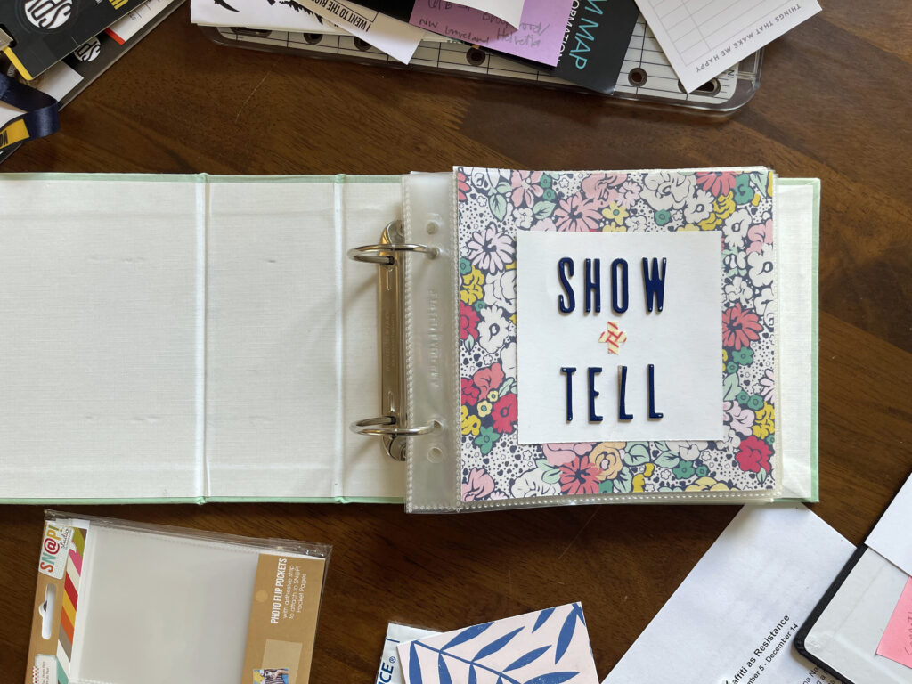
The album's title page. A piece of square white card stock is centered on a 6-inch by 6-inch piece of scrapbooking paper with a floral design, and placed inside a 6-inch by 6-inch plastic page protector. Navy blue capital letters spelling out "SHOW" and "TELL" are affixed to the front of the page protector. Two piece of red and white striped washi tape make a plus-sign to read as the word "and" in "show and tell."

Their class at daycare was learning to write around this time and I wanted to document my kiddo’s handwriting and their progress with their penmanship throughout the course of the year too. So I did. Instead of using alphabet stickers to accompany/introduce each letter, I used my child’s handwriting. I had them use a stylus on my iPad each week to write that week’s letter. Then, I centered the letter on a 6”x6” canvas in Photoshop Elements, typed out whatever item they brought for that week/letter below their handwritten letter, and printed the page on plain white card stock that I cut down to fit in a 6”x6” page protector. For the facing page of each spread I used a photo of my kiddo holding the item they brought for that week/letter. 

I recently dug this album out of storage and flipped through it for the first time in years (a decade?). Opening it up, I knew I hadn’t finished it; I thought I’d made it through only the first few letters. Turns out (!), I made it to letter M. I’m definitely bummed that I left it unfinished, and I’m so happy that I made it through as much of this project as I did—I managed to document half the alphabet. Here’s a look inside.

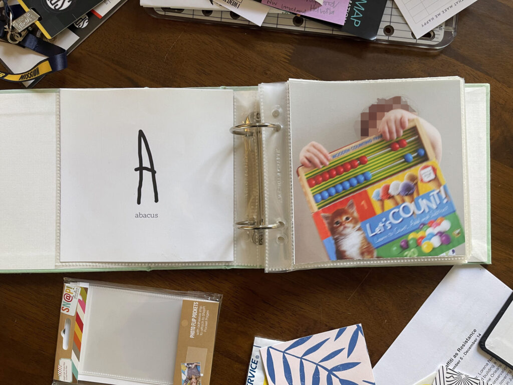
The opening spread of the album. The letter "A" in my child's handwriting at the time is on the left page with the word "abacus" typed beneath it. On the facing page, a photo of my child holding up a "Let's Count!" board book that has an abacus attached to the top of it.

I know it might be hard for some to believe a child would know what an abacus is and choose to bring one to show and tell. Here’s the thing: We are a family of autistics.

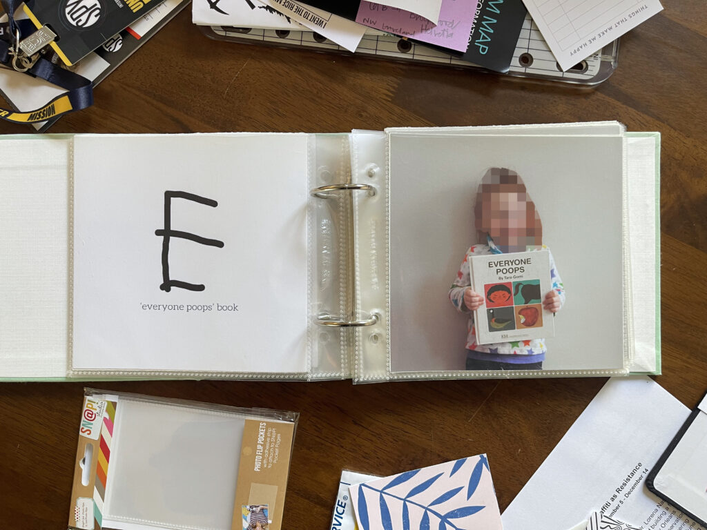
The spread for letter "E." On the left page, the letter E in my child's handwriting at the time and "'everyone poops' book" typed beneath it. On the facing page, a photo of my child holding "Everyone Poops," a classic children's book. Fun fact, this particular copy belonged to their dad and bears all the ripped page corners and pen and pencil scribbles from his childhood.

Fun fact: This copy of the classic children’s book Everyone Poops belonged to my kiddo’s dad when he was a kid and comes complete with his ripped pages and pen and pencil scribbles throughout. This book, along with B.J. Novak’s modern classic The Book With No Pictures got a lot of laughs in those early years.

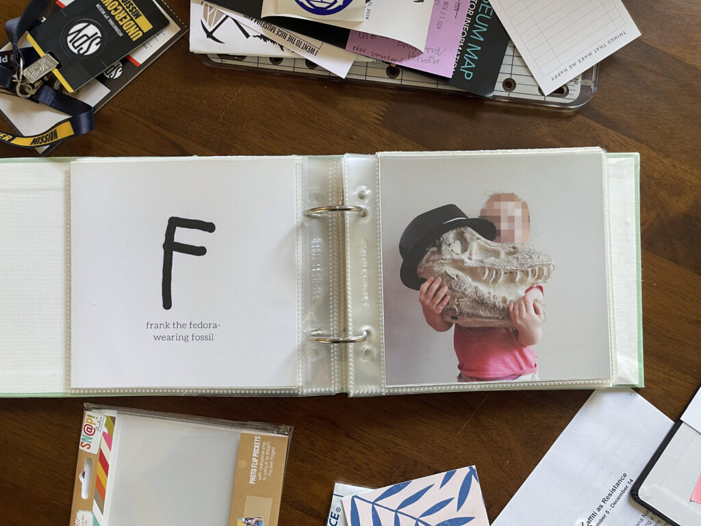
Spread for the letter "F." On the left page, the letter "F" in my child's handwriting at the time and "frank the fedora-wearing fossil" typed beneath. On the right page, a photo of my child holding a "fossil" of a dinosaur head with a black fedora atop it.

Frank!!! Frank was a “fossil” I bought for about $15 at HomeGoods when the kids were very young. He didn’t come with the fedora. That belonged to my youngest. Frank’s head became its home when it wasn’t on my son’s head. Frank was a beloved member of our family for many years. In 2021 we gifted him to a family with an autistic child who LOVED dinosaurs. (We thought Frank was fun and enjoyed having him around. Despite the autism, none of us were (or are) into dinosaurs in the autistic way.)

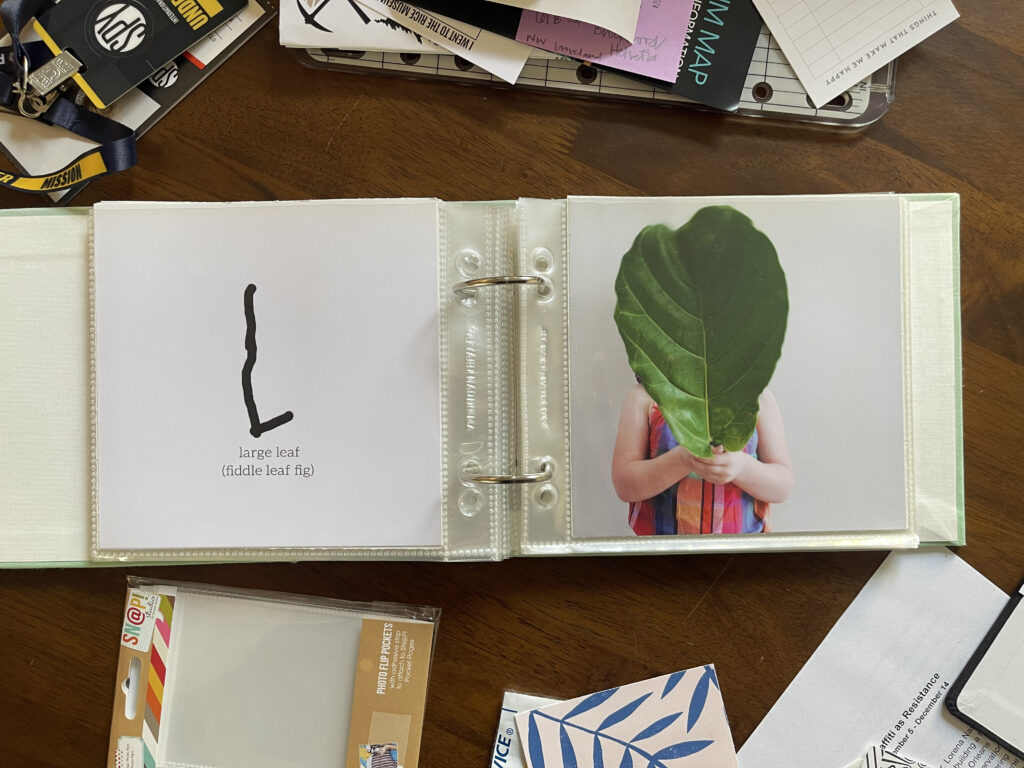
Spread for the letter "L." On the left page, the letter "L" in my child's handwriting at the time and "large leaf (fiddle leaf fig)" typed beneath it. On the facing page, a photo of my child holding an enormous fiddle leaf fig leaf that covers their entire face and most of their body. The leaf was from the tree we had in our home at the time.

What can I say? Like everyone with an Instagram account at the time, we had a fiddle leaf fig (and a monstera) in our home.

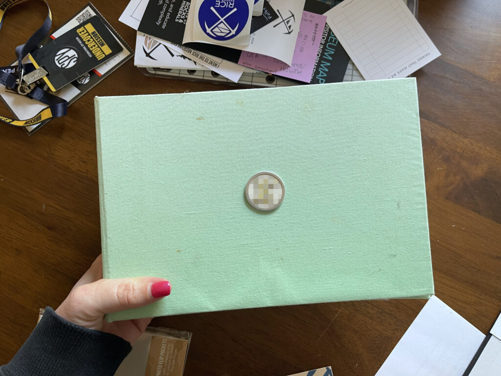
For this project I used an American Crafts cloth-covered album in seafoam (featuring one-of-a-kind accents of stains and smudges acquired from handling and storing and moving over the years). Sadly, this album is no longer available (sadly-er, many memorykeeping brands and supplies and forums and blogs have disappeared in recent years).

The front cover of the album, as described in the body of the post.

To the center of the front cover I affixed a metal-rimmed paper key tag sticker and then stuck a patterned alphabet sticker (blurred) of the letter of my child’s first name in the center of it. I bought a few packs of the paper key tag stickers from Michael’s years and years ago. I can’t find a listing for them on their website. Here’s a similar product from Amazon (sorry!) that you could use without the ring and with double-sided tape, or a double-sided foam sticker, or any strong glue.

For the title page (first photo at the top of the post) I cut down pieces of patterned scrapbook paper and white card stock, and used alphabet stickers and washi tape to spell out “show + tell.” At the time, I wasn’t sold on my title page so I stuck the stickers and tape to the outside of the page protector instead of the piece of white card stock. I wish now that I hadn’t. The alphabet stickers and washi tape are from a monthly scrapbooking kit that no longer exists (RIP). You can find a pretty big selection of alphabet stickers on Scrapbook.com or in-person at Michaels. You can find washi tape at a million places online and in-store at Target and Michaels and the like.

If I were to do this project again—or start it today—I would use a 4″x4″ album instead of a 6″x6″ one—and not just because no one seems to sell 6″x6″ albums anymore. Back in the day I chose the larger size because I thought 4″x4″ would be too small to document my child’s handwriting “enough” (does that make sense?). The smaller size would’ve been perfectly fine. You live and you learn. (Annoyingly, it seems you can’t buy a 6″x6″ album anymore but you can get 6″x6″ page protectors, and you can’t get 4″x4″ page protectors anymore but you can get a 4″x4″ album.)

* * *

Related: There’s a monthly Show and Tell for Grown Ups Meetup in Portland that I think would be super fun to attend. I haven’t been able to make it yet. It’s a new group and they’ve had only two meetups so far, both on weekday evenings at times that are a few hours too late for me. If they ever do a daytime session on a Saturday or Sunday, I’m there.

Sending Smiles: a mini zine

This summer, I went for a lot of walks. I took tons of photos during those walks, including of the various sidewalk smiley faces I spotted. And then I made a mini zine of some of them 🙂

A sheet of paper with images of sidewalk smiley faces that hasn't yet been folded into a zine and a smiley face greeting card atop my desk.

This was my first-ever attempt at making a zine and I’m both pleased and surprised to report that I’m happy with how it turned out (a miracle). I used a single sheet of paper and followed this tutorial from Austin Kleon on how to fold and cut it (he rips his, I cut mine).

Before I started printing, I used an unfolded one-page zine from my collection to sketch a little diagram on a post-it note to make sure I ordered and oriented my pages correctly. Then, I made a template in Photoshop Elements. Because my regular-degular printer doesn’t do full-bleed printing, I fucked around a bit with the sizing and spacing of each page/rectangle layer in Photoshop to try to get the white border as uniform as possible on all sides of each page. Because I have zero actual art skills—I can’t sketch or draw or paint to save my life (sad!)—the front of the zine is a scan of the front of a greeting card from my collection that happens to very perfectly fit the smiley face theme.

I printed the front panel in color and the rest in black and white. The smiley faces in the last spread are a little hard to see in the accompanying photo—the one on the left is jack-o’-lantern-esque, the one on the right is in line with the cracks in the concrete. My favorite smilies are—in order—the one on the right side of the second spread (third pic below) and the one on the left side of the first spread (second pic below).

Front cover of my "sending smiles" mini zine, featuring the front of a smiley face greeting card that I scanned in and sized down to fit the zine.
First spread of my "sending smiles" zine. A different sidewalk smiley face is printed in black and white on each page.
Second spread of my "sending smiles" zine. A different sidewalk smiley face is printed in black and white on each page.
Third spread of my "sending smiles" zine. A different sidewalk smiley face is printed in black and white on each page.
Back cover of the "sending smiles" zine, featuring a peace sign, a heart, and a smiley face drawn into concrete.

Originally this mini zine was going to be an edition of one—it was going to be a gift for only my former roommate, to whom I texted all these photos in real time as I found them and who always enjoyed them so much. I decided to print a copy for another friend in New York after a recent long phone call that helped encouraged me to start making and memorykeeping and blogging again. And then I decided to also print copies for each of my three kids. For the two who aren’t currently here with me, I bought these fun smiley face greeting cards at Powell’s to send the zines in. So cute!

Two hot pink greeting cards with 5 rows of 4 yellow smiley faces each covering the front of the card.